Be yourself; Everyone else is already taken.
— Oscar Wilde.
This is the first post on my new blog. I’m just getting this new blog going, so stay tuned for more. Subscribe below to get notified when I post new updates.
Be yourself; Everyone else is already taken.
— Oscar Wilde.
This is the first post on my new blog. I’m just getting this new blog going, so stay tuned for more. Subscribe below to get notified when I post new updates.
This week was my first week
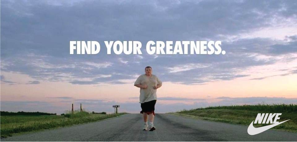
This is the original ad that I used to create my ad campaign. It is simple but effective and easy to relate to. I like how easy it is to read. I was asked to create a new ad that matches this ad and has similar elements.
This is the link to the original post. I found it online.
There are a lot of design elements in this ad. It uses rule of thirds and focal point really well. Everything is pointing to the runner. The road, the grass, the sky all seem to develop the focal point.
The colors used in the photograph help with the symmetry. It’s so balanced with the same color on both sides of the image.

The only typography looks like it uses Impact font. It very bold and blocky and works well for a headline.
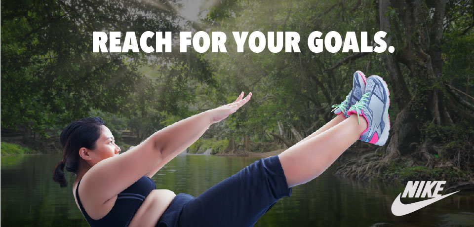
This was the ad I created to match the original professional ad. I think it has a similar feel and style to it as the original ad.

The woman in the image is in the same shape as the Nike swoosh she also creates alignment because of the way her arms and legs are parallel to each other. It has a similar feel to the original image even though the lines are a little different. It still uses rule of thirds
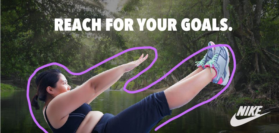
There is a decent amount of contrast between the woman and the background. This makes it seem like she pops off the page. This also fits with the other campaign because of the outdoorsy colors.

The typography in this ad is the same as the type in the other ad. It’s bold and impactful.
Both ads have some similar elements and some pieces that are different. They look similar enough to be in the same campaign but different enough to be used in different applications.
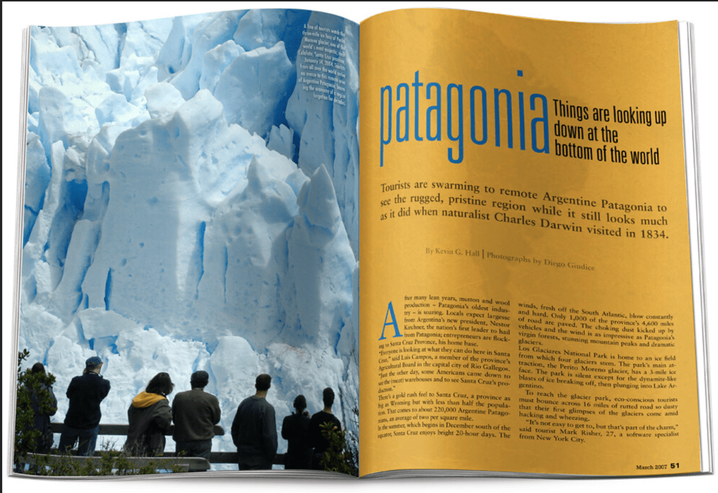
This is a National Geographic magazine spread. I think it has all the elements of a great spread. I found this example being used online as a mockup example probably because it is well designed. There are great examples of contrasting typography with varying size and weight as well. I also think the photograph is beautiful.
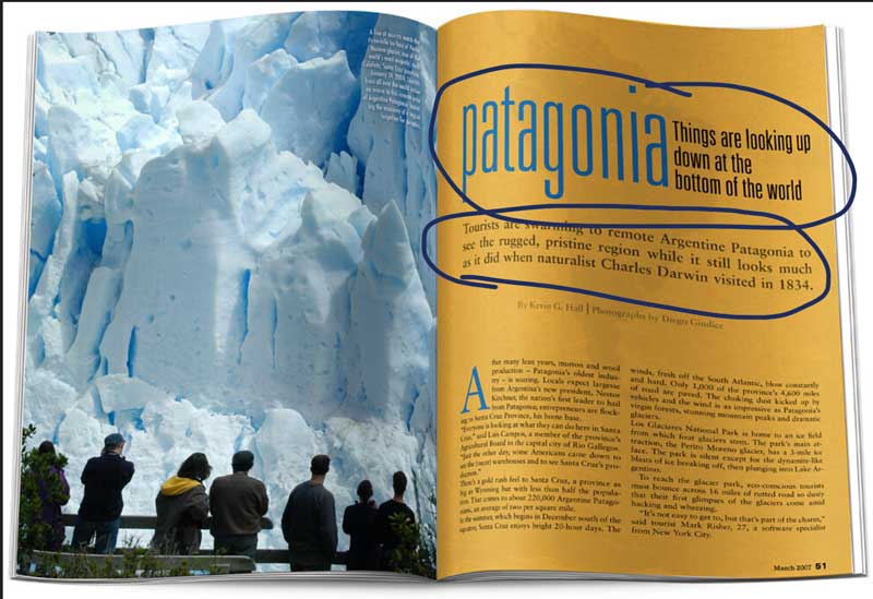
The heading in this article uses a modern sans-serif type. It is bold with a tall x-height and lowercase lettering throughout. The sub-headline is different with a shorter x-height and and serifs.
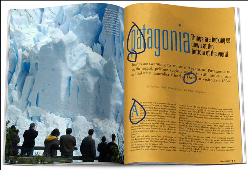
The sans-serif headline contrasts with the serifs on the subhead and paragraph below. The headline is very clean and simple as well as modern and it’s completely different from the more traditional serif typeface. The large uppercase A is the same color as the heading but it’s the same font as the paragraph to help unify the design. The serif paragraph and subhead typeface have a much smaller x-height and are very easy to read which is why they were probably chosen for the body of the article.
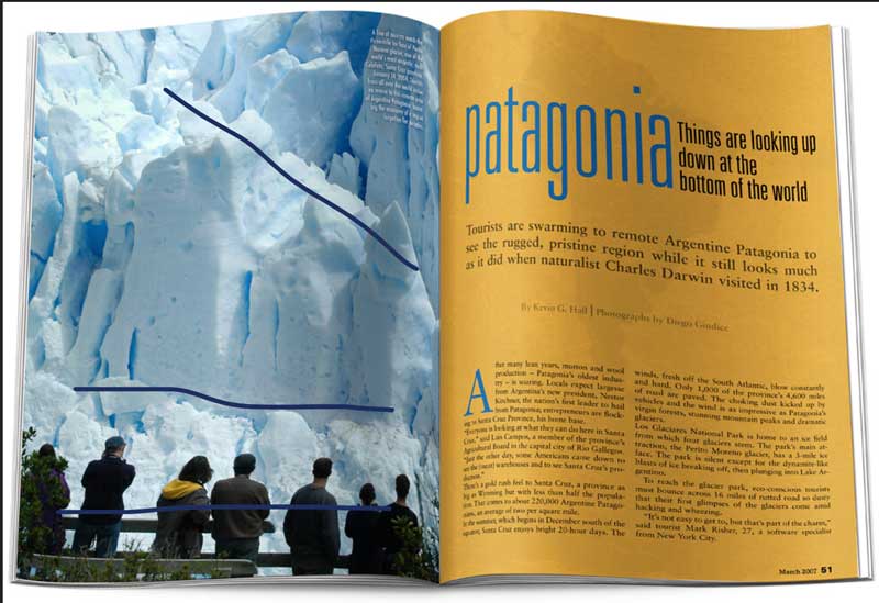
There are some good examples of leading lines in this photograph. The people lines up at the bottom as well as the natural lines created by the ice. It’s a very organic image with contrasting dark clothing against the icy blue cliffs. The people also help to create the rule of thirds in this image.
I picked this article because I thought it was beautiful. The icy blue and the yellowy orange are great contrasting colors and look excellent paired next to each other. The contrasting typefaces also compliment each other well. The silhouetted people create these dark shapes against the snowy cliffs and make the photograph very interesting.
The Design poster I chose to use was a contest winner from the Rochester design institute. The winner is named Sophia Del Plato. I chose it first of all because I like the colors but also because it looks whimsical and professional at the same time. It almost feels like Toy story because of the rocket and the colors and having been on the Toy Story ride at Disneyland many times this poster looks like it belongs on the walls in that ride.
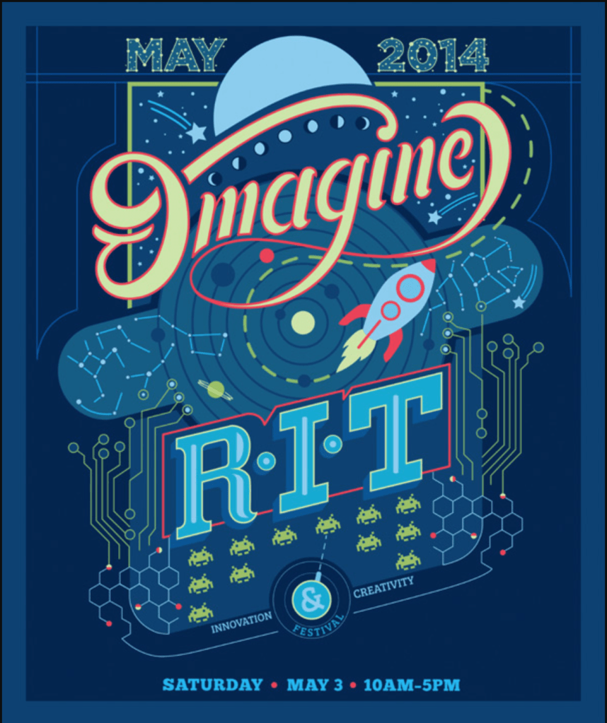
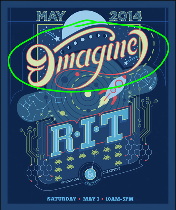
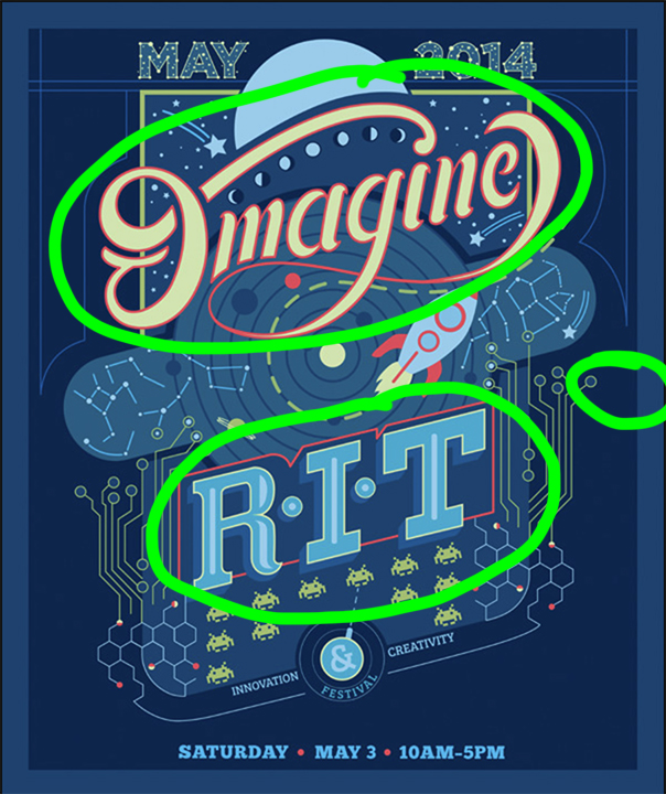
The first design principle I want to point out is the designers use of contrast. She used contrasting colors with the bright orange red color surrounding the yellow lettering as well as contrasting font choices. The font used for the word Imagine is rounded and more script like and is so different from the sharp edges of the R.I.T acronym. The bright yellow imagine compliments and contrasts the blue background and creates a strong focal point because the colors are so different from each other.
This poster also contains a lot of repetition. There are repeated elements throughout. This also falls under alignment because this poster is very balanced. A lot of the elements like the constellations and the video game type patterns are repeated on both side of the poster. Even the little alien guys are repeated. The bright pinky red color is also used around the Imagine word and then again around the very different RIT font to create continuity between the two.
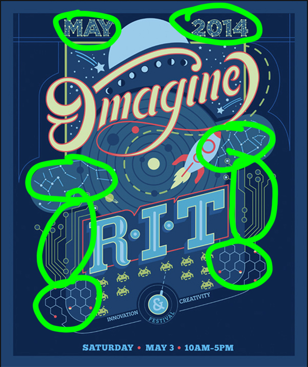
I really like the slightly tilted Alignment in this poster. Most of the elements are aligned with this tilt except a few pieces of information that helps us to distinguish it from the rest. The dates are smaller but they stand out a little because they are not aligned with everything else. I also think the bullseye in the middle created a good spot to align everything else off of.
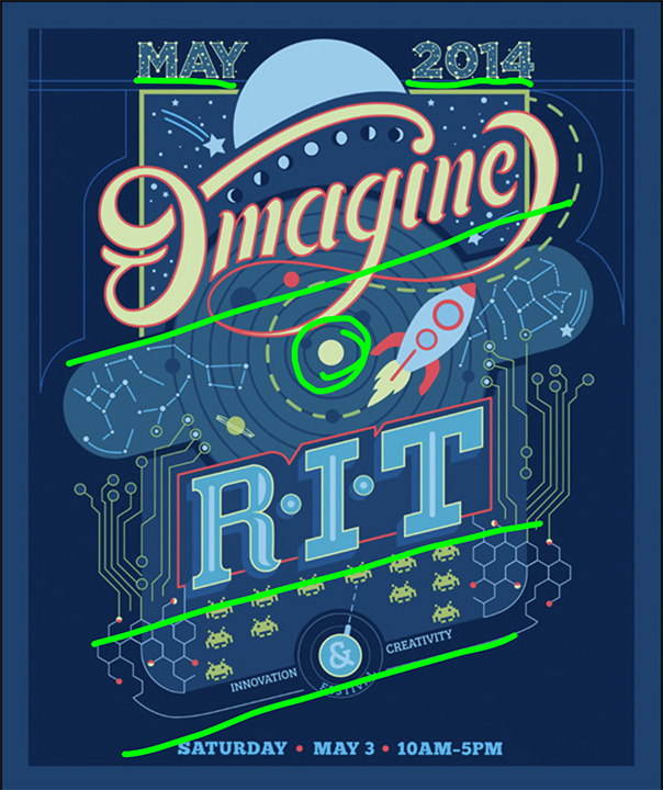
So this poster did a good job of putting a lot of stuff in it without making it overly crowded. The elements are very close to each other but there is still space on the outside for the eye to rest. She also grouped like information closely together like the date. the little illustrative components like the aliens or the honeycomb shapes are also grouped together well. I think the proximity in this poster is strong.

Color is probably why I picked this poster in the first place. The blue really speaks to me and the different shades of blue add interest. The Contrasting yellow-orange is the complete opposite on the color wheel from the blue purple to it creates a strong focal point for the headline. The designer also uses that orangy red color in other places to create a very pleasing color pallet.
I really enjoyed finding all the different design elements in this poster. I think these kids of activities will help me to be a better designer. I think the strongest elements in the poster are the contrasting colors and all the offset alignment. I just love it.
This is an example post, originally published as part of Blogging University. Enroll in one of our ten programs, and start your blog right.
You’re going to publish a post today. Don’t worry about how your blog looks. Don’t worry if you haven’t given it a name yet, or you’re feeling overwhelmed. Just click the “New Post” button, and tell us why you’re here.
Why do this?
The post can be short or long, a personal intro to your life or a bloggy mission statement, a manifesto for the future or a simple outline of your the types of things you hope to publish.
To help you get started, here are a few questions:
You’re not locked into any of this; one of the wonderful things about blogs is how they constantly evolve as we learn, grow, and interact with one another — but it’s good to know where and why you started, and articulating your goals may just give you a few other post ideas.
Can’t think how to get started? Just write the first thing that pops into your head. Anne Lamott, author of a book on writing we love, says that you need to give yourself permission to write a “crappy first draft”. Anne makes a great point — just start writing, and worry about editing it later.
When you’re ready to publish, give your post three to five tags that describe your blog’s focus — writing, photography, fiction, parenting, food, cars, movies, sports, whatever. These tags will help others who care about your topics find you in the Reader. Make sure one of the tags is “zerotohero,” so other new bloggers can find you, too.
