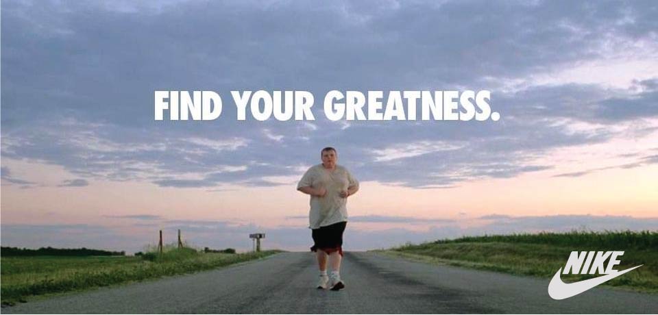
This is the original ad that I used to create my ad campaign. It is simple but effective and easy to relate to. I like how easy it is to read. I was asked to create a new ad that matches this ad and has similar elements.
This is the link to the original post. I found it online.
There are a lot of design elements in this ad. It uses rule of thirds and focal point really well. Everything is pointing to the runner. The road, the grass, the sky all seem to develop the focal point.
The colors used in the photograph help with the symmetry. It’s so balanced with the same color on both sides of the image.

The only typography looks like it uses Impact font. It very bold and blocky and works well for a headline.
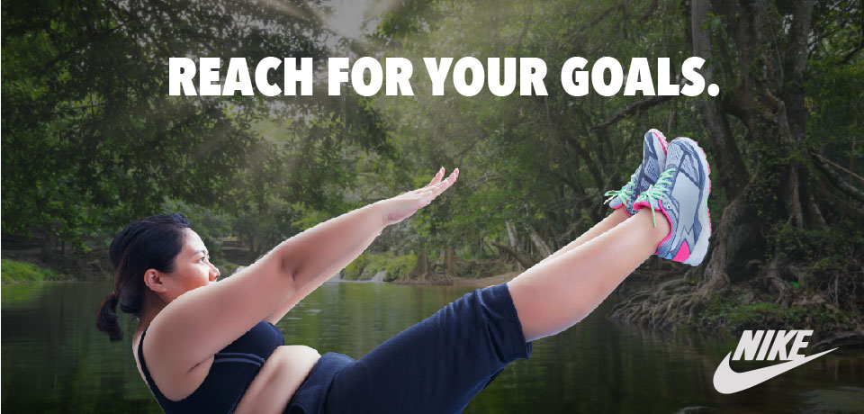
This was the ad I created to match the original professional ad. I think it has a similar feel and style to it as the original ad.

The woman in the image is in the same shape as the Nike swoosh she also creates alignment because of the way her arms and legs are parallel to each other. It has a similar feel to the original image even though the lines are a little different. It still uses rule of thirds
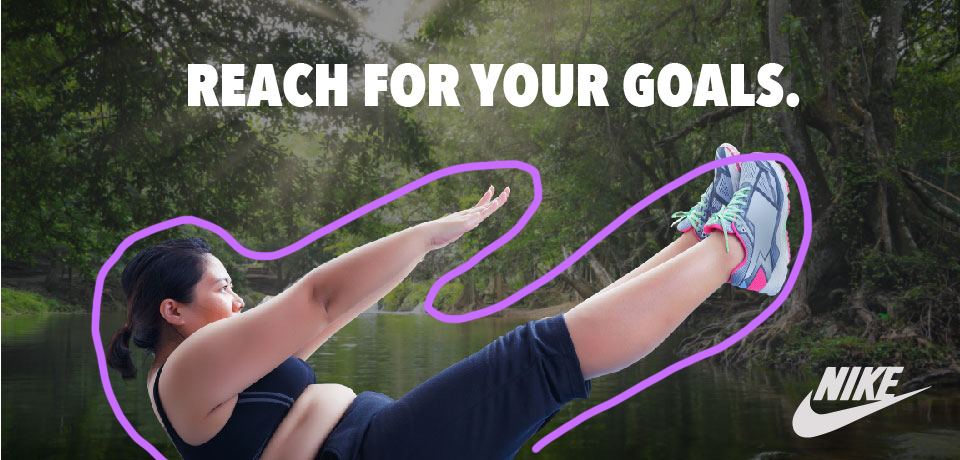
There is a decent amount of contrast between the woman and the background. This makes it seem like she pops off the page. This also fits with the other campaign because of the outdoorsy colors.

The typography in this ad is the same as the type in the other ad. It’s bold and impactful.
Both ads have some similar elements and some pieces that are different. They look similar enough to be in the same campaign but different enough to be used in different applications.
