Reverse Engineer post
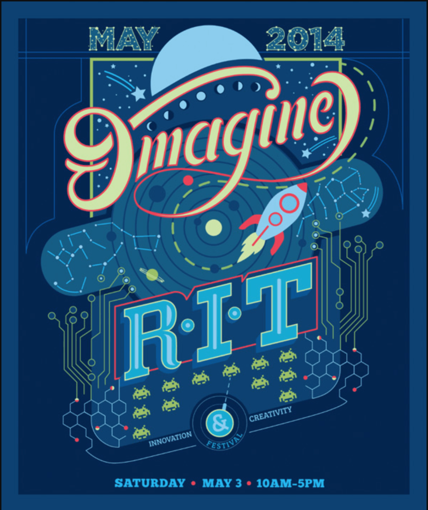
The Design poster I chose to use was a contest winner from the Rochester design institute. The winner is named Sophia Del Plato. I chose it first of all because I like the colors but also because it looks whimsical and professional at the same time. It almost feels like Toy story because of the rocket and the colors and having been on the Toy Story ride at Disneyland many times this poster looks like it belongs on the walls in that ride.
Contrast
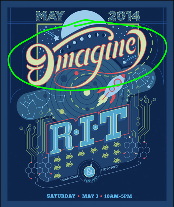
The first design principle I want to point out is the designers use of contrast. She used contrasting colors with the bright orange red color surrounding the yellow lettering as well as contrasting font choices. The font used for the word Imagine is rounded and more script like and is so different from the sharp edges of the R.I.T acronym. The bright yellow imagine compliments and contrasts the blue background and creates a strong focal point because the colors are so different from each other.
Repetition
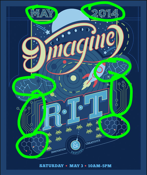
This poster also contains a lot of repetition. There are repeated elements throughout. This also falls under alignment because this poster is very balanced. A lot of the elements like the constellations and the video game type patterns are repeated on both side of the poster. Even the little alien guys are repeated. The bright pinky red color is also used around the Imagine word and then again around the very different RIT font to create continuity between the two.
Alignment
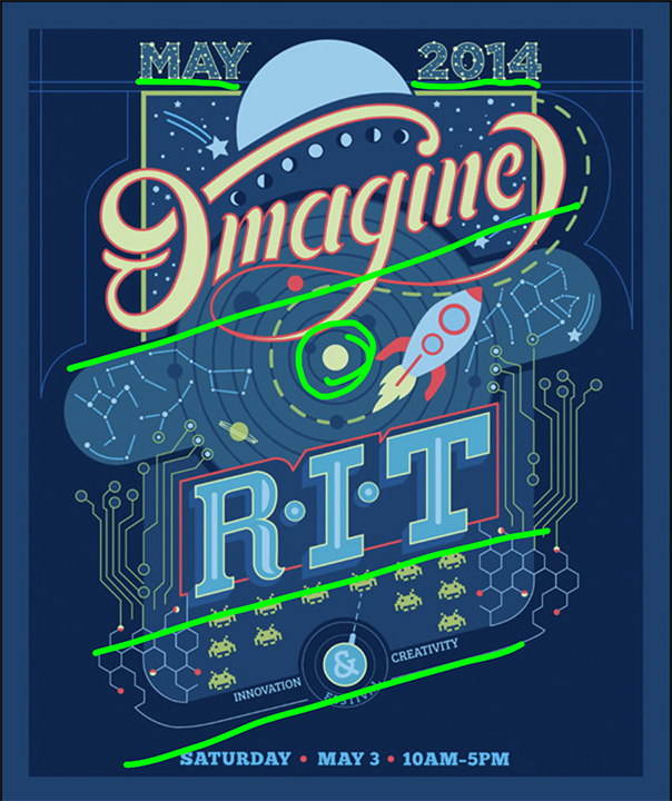
I really like the slightly tilted Alignment in this poster. Most of the elements are aligned with this tilt except a few pieces of information that helps us to distinguish it from the rest. The dates are smaller but they stand out a little because they are not aligned with everything else. I also think the bullseye in the middle created a good spot to align everything else off of.
Proximity
So this poster did a good job of putting a lot of stuff in it without making it overly crowded. The elements are very close to each other but there is still space on the outside for the eye to rest. She also grouped like information closely together like the date. the little illustrative components like the aliens or the honeycomb shapes are also grouped together well. I think the proximity in this poster is strong.

Color
Color is probably why I picked this poster in the first place. The blue really speaks to me and the different shades of blue add interest. The Contrasting yellow-orange is the complete opposite on the color wheel from the blue purple to it creates a strong focal point for the headline. The designer also uses that orangy red color in other places to create a very pleasing color pallet.
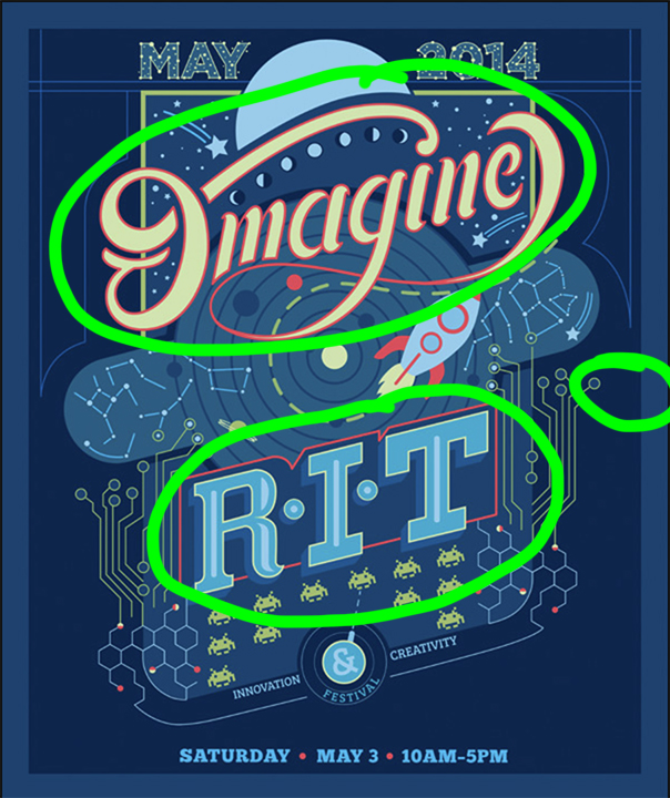
I really enjoyed finding all the different design elements in this poster. I think these kids of activities will help me to be a better designer. I think the strongest elements in the poster are the contrasting colors and all the offset alignment. I just love it.
